Advisor Planning Request

Northwestern Mission
Northwestern Mutual aims to be the pre-eminent financial security firm by consistently focusing on one ambition: to make a meaningful impact on their financial professionals and staff, their clients and their communities.
Northwestern Vision
We exist to free Americans from financial anxiety so that they can live the life they want both today and tomorrow by enabling household to move to higher levels of financial security through an optimized mix of investment and insurance solutions.
Design Mission
Design and deliver the most important tools and solutions that will make a materially positive difference to the business and exceed the expectations of our users.
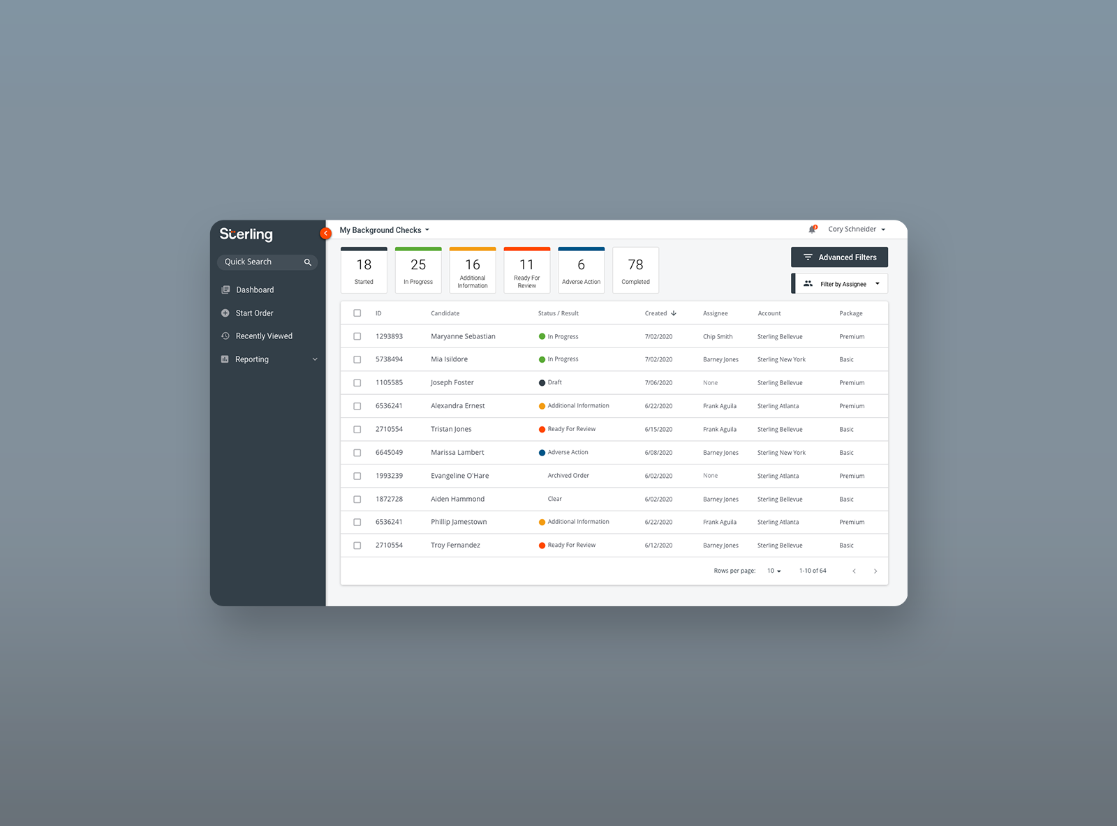
Understand Phase
The current support request center has a substantial field user base – currently there are 7,571 users that pay a subscription for these services. In 2022 there were over 80k requests for Financial Plans, Illustrations, Morningstar Reports, Consultation, Advisory and Brokerage Sales Kits, and Investment Client Transfer and Onboarding.
Based upon the timeline and scope of the project, we were unable to preform new research for this project. To better understand our audience I reviewed a 2023 subscriber survey and inteviewed support request agents.
The results show that every respondent was aware of our PX Plan service, with nearly 80% of them saying they are using this service. Each other deliverable made up at most, 41% of use. The overall theme for planning request types was that it was difficult to input notes for support agents to complete their planning request. Additionally, Illustration requests lacked the ability to be customized
In interviews with support request agents, we also found that often requests were incomplete which increased fulfillment time.
Define Phase
After reviewing pre existing research we decided to focus on ease of use. We want to understand if Financial Representatives can navigate through the SRC flow seamlessly.
We want to understand user expectations of this planning and illustration workflow and where additional context is needed.
Problem Statement
If we create a clearer, easy to use planning and illustration support request experience for financial advisors, we will improve satisfaction and decrease the time to complete orders.
Sketch Phase
We focused iterating on the planning and illustration request types that would solve major customer pain points. Three solutions will be tested with focuses on users’ speed of completion, understanding, confidence and ease of use.
Objectives
- Discoverability – We want to understand what would make SRC easier to use.
- Workflow Usability – We want to understand if Financial Representatives can navigate through the SRC flow seamlessly.
- Expectations & Context – We want to understand user expectations of this SRC workflow and where additional context is needed in the process to help them avoid pain points
- Language & Terminology – We want to understand if the language used matches user understanding of the content.
Methodology
- 3 weeks for creating design concepts for discovery and sharing with business
- Each sprint we’ll conduct a stakeholder share out prior to field conversations
- 5-6 field users per testing round
Round 1 - Validation

Concept A
Single page for data collection and paths
Results:
Half of the participants liked everything on one page.
Half of the participants misunderstood dotted lines to indicate drag and drop functionality only and were looking for a bigger notes section
One user noticed missing meeting date when view the data collection

Concept B
Paths outlined in columns on individual page
Results:
Most participants appreciated the similarities to other portions of the enterprise web app
Confusion around dotted lines for adding instructions
Some users enjoyed the similarities in layout between this design NMC

Concept C
Variation on individual page for paths
Results:
Overall participants felt this version was text heavy
“Overwhelming because it looks like a giant paragraph”
Participants did not prefer the ‘carousel’ approach to sliding paths into view

Concept D
Notes focused path with note templates and Factfinder reference
Results:
Overall participants found this concept to be too busy.
One users suggested to not have full notes templates but rather freeform text only
Spending time putting notes into individual sections would take too long
What concept did participants prefer the most?
Participants were split between Concept A and Concept B.
Participants that preferred Concept A enjoyed having access to everything on one page. Participants that preferred Concept B mentioned they would like to reference notes from a current path when completing a proposed path.
How many paths do participants normally create?
3 out of 4 participants cited only using one path in their requests. Participants primarily create one path, with a few exceptions of an additional proposed path.
Participants that create several paths are more of an edge case that needs to be supported based off of this first round of participants.
Do participants prefer using the term instructions or notes?
3 out of 4 participants preferred the term ‘instructions’ instead of ‘notes’.
Participants liked the context that the term ‘instructions’ provided. Several participants did not actually fill the requests out, but felt their FRs would better understand the goal of the notes section if using the instruction label.
Summary
Based off of the results of this round of validation, it is our suggestion that we proceed with iterations of Concept A & Concept B. We should incorporate more detail into these designs to address the feedback given in this round.
While participants showed concern around not having enough flexibility with copy and pasting instructions, when presented with large instruction areas they found the concepts overwhelming and text heavy. This indicates that we need to explore more detailed solutions around inputting a viewing instructions in both concepts to allow flexibility without intimidating the participants. They would like to be able to quickly add instructions, but want them viewed in a way that is easy to digest the information.
We suggest focusing on solutions that focus on current path with easy proposed path functionality, but do not want to prioritize views for much more than two paths. Further information about the differences in FRs plans when submitting more than two paths would be valuable.


Round 2 - Validation
Concept A
Paths outlined in columns on individual page vs single page with data collection
Illustration request available within modal
Results:
Add instructions buttons were not obvious
Heavy notes users will not likely use paths, this is more of an edge case
No concerns having paths on a separate page
Joint work was brought up on several occasions as ideally included
While some like to see available illustrations all at once, others do not want to have to view on multiple pages, dropdown is a possible solution

Concept B
Card selection for new illustration request
Results:
Some participants like that it takes up screen real estate, some only want to see selections made once selected
Participants prefer not to to go back and forth with selections
They like to see more details in summaries
Its not showing all of the products that we could illustrate

Concept C
Column selection for new illustration request
Dropdown selection for illustration type
Quick add and customize functionality
Modal vs inline illustration selection
Results:
Would prefer the requested and available sections flipped
This looks even more simplified than Concept B, not too complicated
Dropdown would be better to be able to save time
Might want to show illustration templates at the top of the list
Would like to see more details for items in “cart”


Concept D
Quick add vs customize flows
Results:
Helpful to newer reps because it walks through the steps
Would like to see information tooltips to be able to see definitions for newer FRs that are still learning
Having the option for both quick add and customize would be nice for their approach to sending requests
Some details missing such as how many year pay, waiver of premium benefit, ECB in customize section
Would like to be able to save custom settings to quick add
What concept did participants prefer the most?
Participants primarily preferred Concept C with the exception that they preferred having the column order swapped. Initial impressions of Concept B were appealing as well, but ultimately 3 out of 5 participants preferred Concept C.
How many paths do participants normally create?
Participants were split between either only creating one path, with a few exceptions of an additional proposed path.
Again in this round, participants that create several paths are more of an edge case that needs to be supported based off of this first round of participants.
Do participants prefer using the term instructions or notes?
5 out of 5 participants did not have a preference using the term ‘instructions’ instead of ‘notes’. Though some referenced that instructions would make sense for newer users.
1 out of 5 participants only used notes for planning and illustration requests in the current experience.
Summary
Based off of the results of this round of validation, there was no preference between a single page and separate page planning request. Additionally, participants no longer felt overwhelmed with the content and thought the instructions functionality was straightforward. It is our suggestion that we proceed with separate pages for planning request data collection and paths for Concept A.
This will also account for the edge case users higher usage of instructions for paths and allow for more space for larger notes sections. With heavy instructions users being more of an edge case, we should discuss what requirements we would like to see in the MVP for planning requests (saved instruction templates, etc.) We are happy to provide design solutions for Day 1 & Day 2 based on stakeholder priority.
Additionally, the majority of participant's preferred Concept C for an illustration request solution. Traditionally we would verify this in an additional round of feedback, but based off of the results and compressed timeline we can proceed while incorporating the suggested changes from participants such as; swapping left and right columns, correcting specific customization details, adding instructions or tool tips etc.
Final Design
The final visual design was a joint effort between myself and another senior designer. We based the visual design on our marketing team's new brand update.