Remitly's vision is to transform the lives of immigrants and their families by providing the most trusted financial services on the planet.
Focus has always been a key part of our strategy and our initial laser focus is on transforming the global remittance industry. Over time, we will leverage our trusted financial services brand and our global network to extend into other financial services.
ROLE
Lead Designer
TIMELINE
March 2021 - July 2021
TOOLS
Figma, Sketch, Proto.io, UserTesting
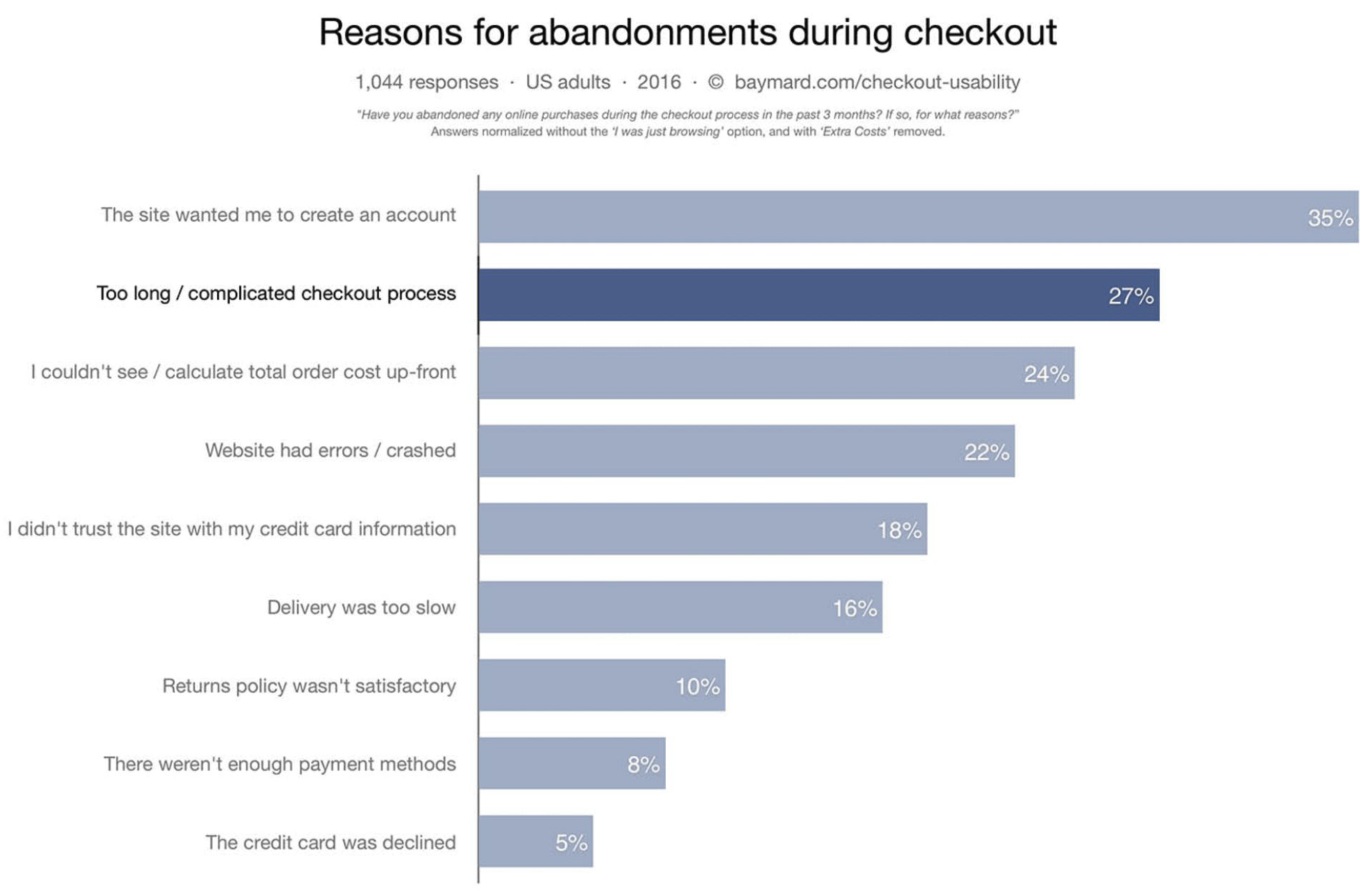
One of the top reasons for abandonment during checkout is having too many steps.
Our CS and CI teams have discovered that both our users and our call centers are reporting problems with funnel length and user accuracy.
HYPOTHESIS
If we utilize form field best practices, new conversational text, new layouts and usability improvements
Then customers will experience reduced time to submit transfers, and increase conversion rates
Because customers will not have to spend long amounts of time entering information and enjoy the ease of use.
PROBLEM STATEMENT
North america customers need a simple and straightforward transfer journey to send money internationally as quickly as possible.
Understand
The send flow redesign will have a large impact on Remitly's business. The end goal is to create a fast easy to use flow that enables our customers to complete their transaction as quickly and accurately as possible.
OPPORTUNITY IDENTIFICATION
One of the top reasons for abandonment during checkout is having too many steps.
Our CS and CI teams have discovered that both our users and our call centers are reporting problems with funnel length and user accuracy.
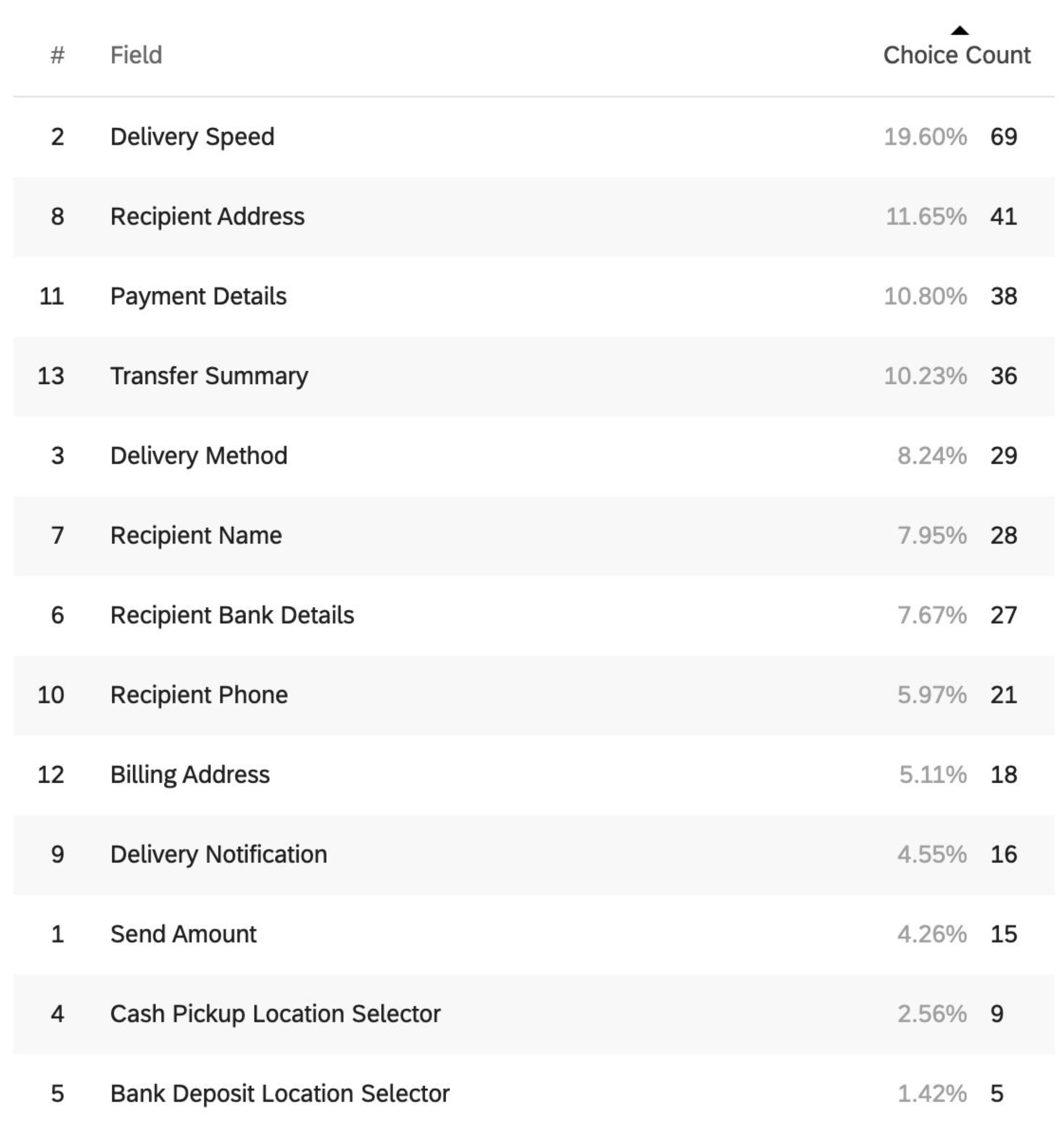
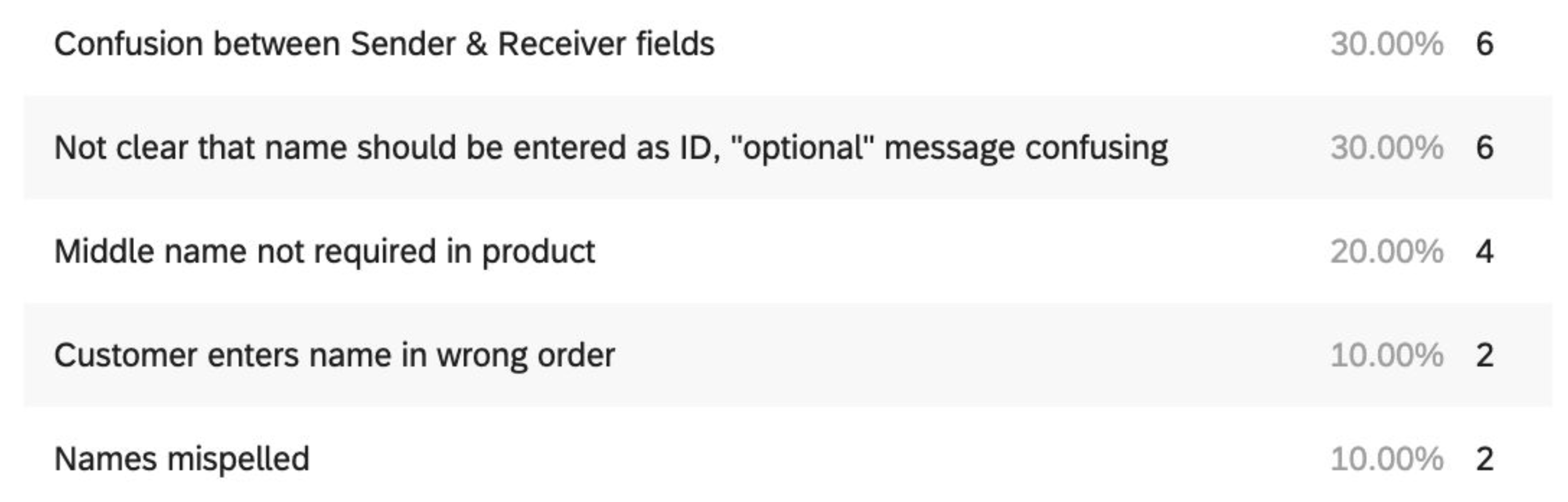
In reviewing a sample of 138 Name Change Amendment phone contacts, two primary root causes surfaced as the reason for needing to amend the Recipient Name Field.
Confusion or mistakes entering the Recipient Name (56%)
Opportunity(s):
Improving the Recipient Name Field would result in a reduction of ~300-400 contacts per week, which would result in an estimated $60,000 - 80,000* reduction in OPEX for the business.
Our hypothesis is that decreasing checkout time and user error will increase preference and speed.
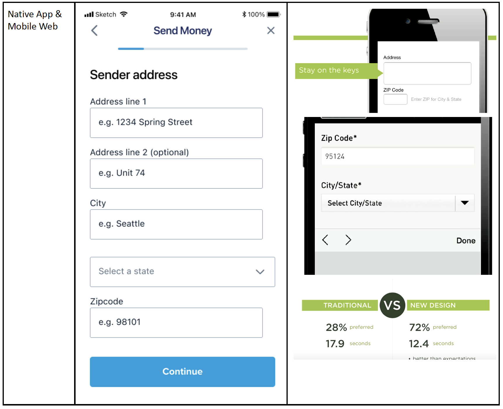
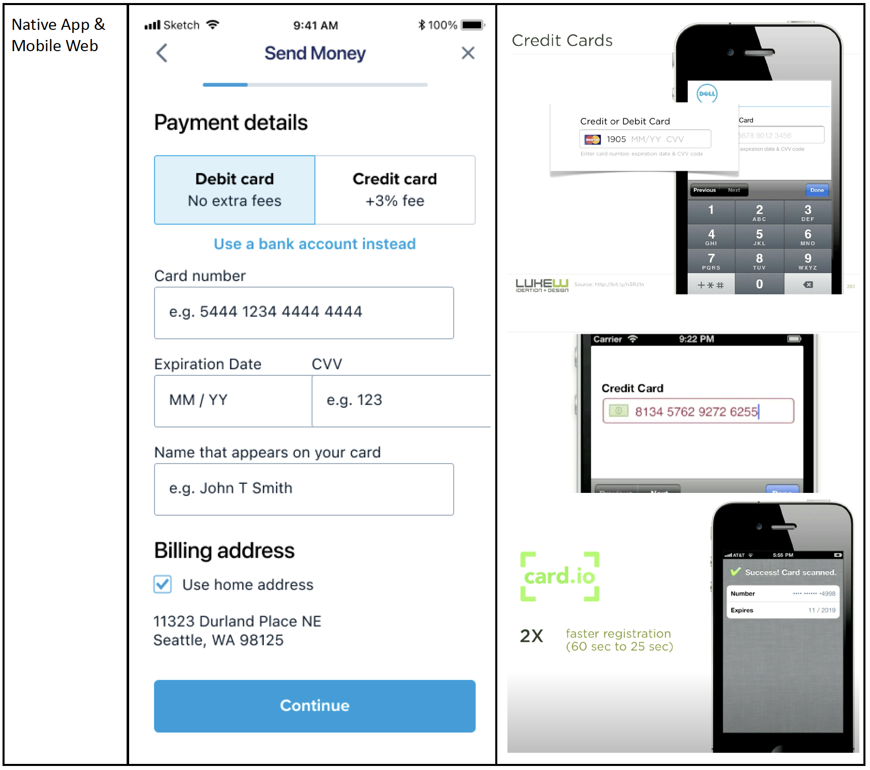
We can do this by testing and implementing progressive disclosure, form design best practices, new layouts, conversational text, font and input sizing, & platform specific controls.
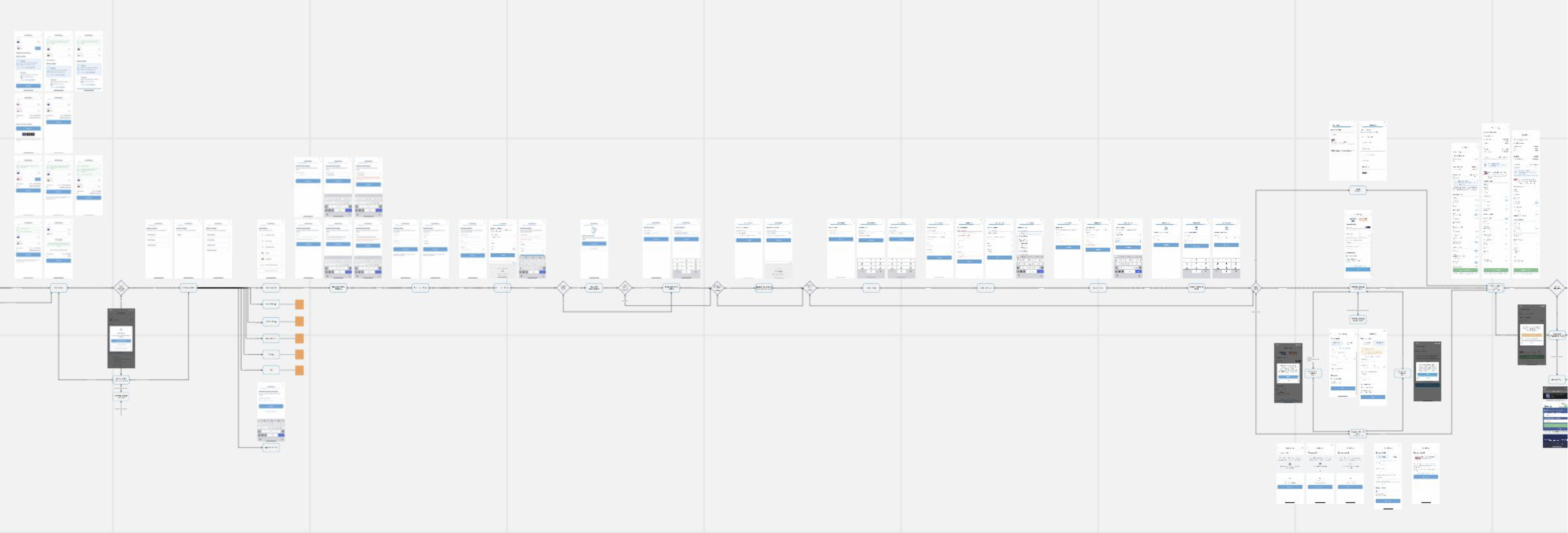
On the left are the steps with the most commonly reported problems by Remitly's customer service agents. The steps with the most problems are Payment Details and Recipient information.
Ideate
I focused iterating on a new transfer journey that would solve major customer painpoints. Three solutions will be tested with focuses on users’ speed of completion, understanding, confidence and ease of use.
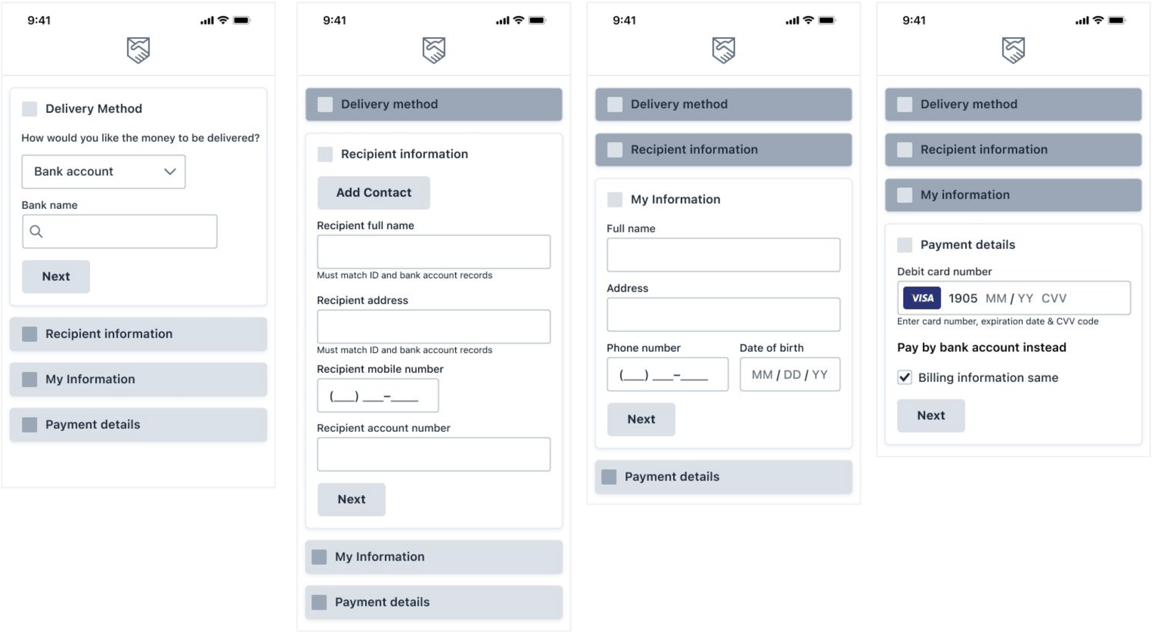
Researching layout approaches, accordion forms tend to be more preferred than long forms with many steps.
Other design experts have more than doubled user preference by using accordion forms and have achieved as much as a 144% speed increase.
Validate
WIREFRAMES
The Product Team is interested to learn of the usability a new transfer journey structure. Three prototypes will be tested with focuses on users’ speed of completion understanding, confidence and ease of use.
OBJECTIVES
Which prototype does the user prefer?
Which prototype did the user complete the quickest?
Which prototype did the user complete the most accurate?
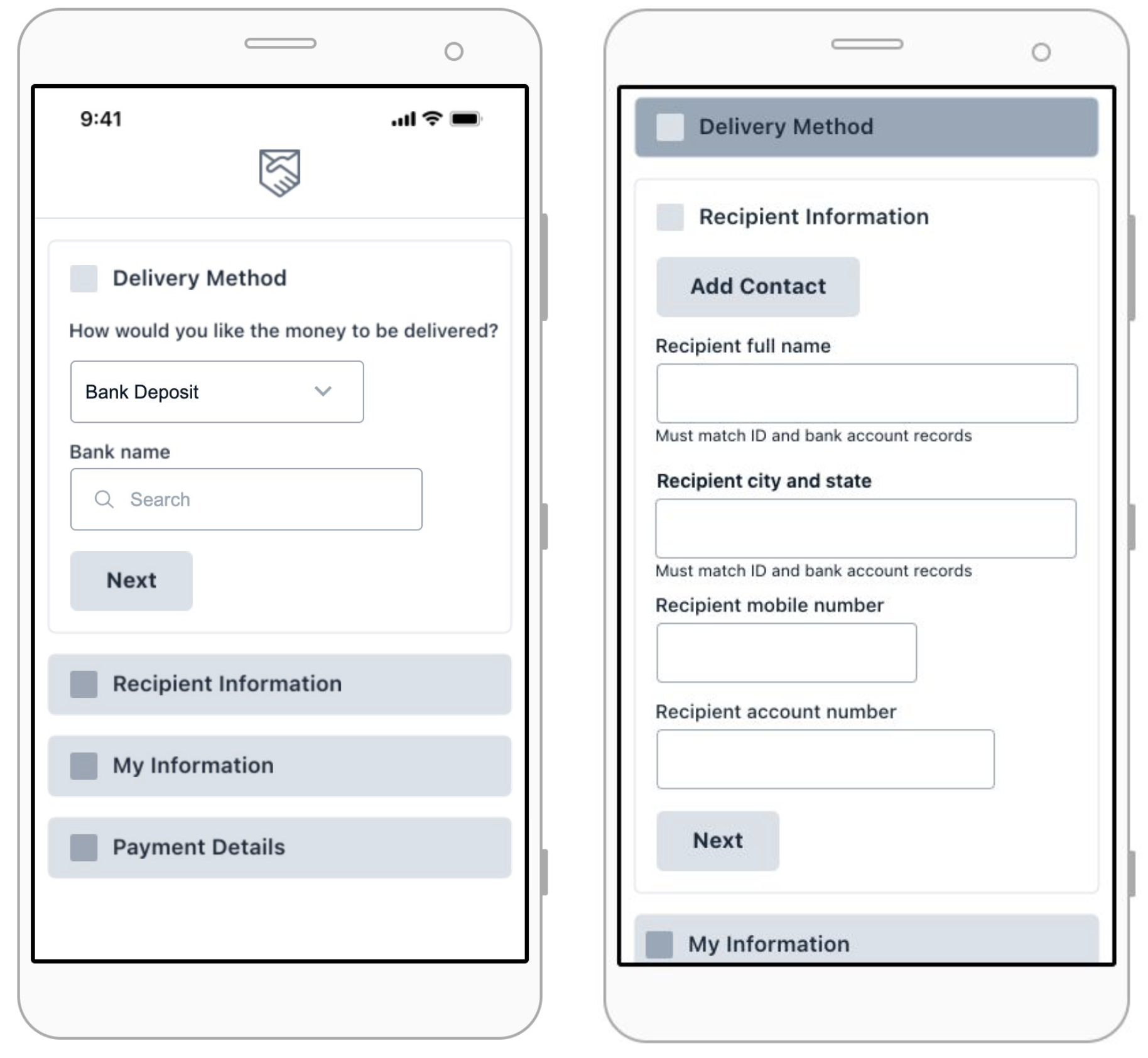
DESIGN A - FIRST IMPRESSION
4/6 users preferred the accordion design in usability testing.
Out of all tests, the accordion was more preferred than other designs. We need to be precise with field grouping. We need to test input types and formatting further.
Most users enjoyed being able to see all the steps on one screen
One user specifically called out preferring the search for bank
One user was focused on the card field, seemed to choose
control because exp and cvv were not separated.
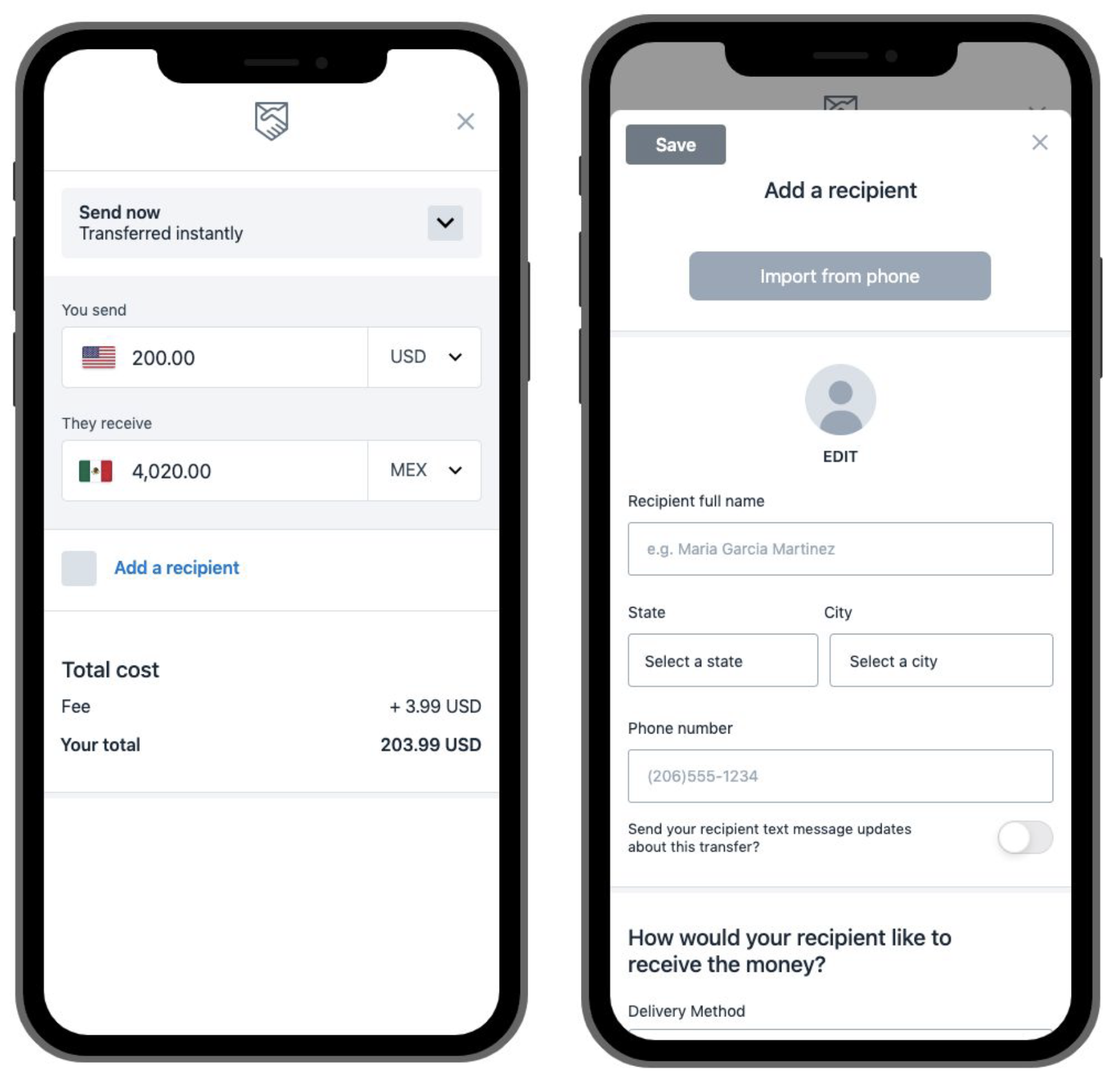
DESIGN B - FIRST IMPRESSION
3/5 users preferred the scheduled send design in usability testing.
Single page form that splits out to individual pages for data collection.
Modern layout that progressive providers like Nico may prefer.
Parent page utilizes current front end for recurring send.
Users preferred the scheduled send experience over current. They felt it was fluid and enjoyed how quick it was.
- Appreciated everything being on one page
- Did not want to keep hitting continue button over and over

DESIGN C - FIRST IMPRESSION
3/6 users preferred the stepper design in usability testing.
While this was generally a flat test in comparison to control, it was noticeable that users completed the form more accurately than in the current experience.
Something of note; only concepts that were substantially different from the current experience performed with a larger preference. Something to think about in regards to live testing over the last year.
WHAT STOOD OUT FIRST?
- Action Required and Status
SUMMARY
Overall we have a rough idea that the scheduled send and accordion are more preferred over baseline, additional tests will be run to improve results and determine which between the two we should move forward with.
Overall most users did not type formatting of dates Formatting can be difficult in visual prototypes, would suggest html prototypes for our next input targeted tests (Axure)
Some users had difficulty selecting exp & cvv in the animated field, could be prototype related
Many users tried to copy and paste information on their phone
Some users mixed up sender and recipient in control prototype

FINAL DESIGN
The final visual design was a joint effort between myself and another senior designer. We based the visual design on our marketing team's new brand update.


