Sterling is a leader in background screening and identity services worldwide. I helped their product teams design provide an entirely new experience for their primary platform.
ROLE
Lead Designer
TIMELINE
June 2019 - March 2020
TOOLS
Sketch, Omnigraffle, Invision, UserTesting
Before beginning design work on the new client experience, the Product and UX teams wanted to elicit feedback from a large group of our clients to learn how they used our products and what their pain points were. The customers represented a variety of industries and were chosen for their size, transaction volume, usage of the platform and their willingness to participate.
10 companies were selected, and participated in a moderated job shadow session where the team observed them interacting with the platform while relaying pain points with the product(s) or places where they would like to see improvement.
In addition to these specific job shadowing sessions, there were also several other customers that have provided feedback and enhancement requests through meetings, summits, and CAB events that have helped inform our notion of how our products were being used, and what we needed to do to improve them.
PROBLEM STATEMENT
Our clients need a modern, easy-to-use platform that helps decrease their time to decision.
Understand
The platform redesign will have a large impact on Sterling's business. The end goal is to unify the client experience across all client platforms.
OPPORTUNITY IDENTIFICATION
Below are most of the common pain points from our customers. They fall into three major categories; placing orders, checking status and reviewing reports.
- Users don’t know what they need to do next to make sure that their candidates are moving through the system.
- The Dashboard is very noisy, and doesn’t effectively provide enough relevant information to the end user.
- Users struggle not having order level tracking, and would like more granularity so that they can understand if there is a problem that they can take action on.
- Users face challenges tracking down missing information for their candidates.
- Initiating an order is a clunky experience, and lacks the ability to bulk upload Candidate Invitations.
- Inability to sort, or flag orders for follow up, or having the ability to reassign them to an individual or a larger work group.
Define
PERSONAS
HR Manager - Manages employees and the overall administration of the Human Resources function. Will sometimes review overall screening progress.
HR Generalist - Day to day management, submitting orders, post hire contact, reviewing results, adding users/admin, actioning results.
HR Specialist - Submitting orders without ability to see results, monitoring candidates.
SUCCESS CRITERIA
An experience that presents a user with items they need to complete rather than having to find the next step to move forward.
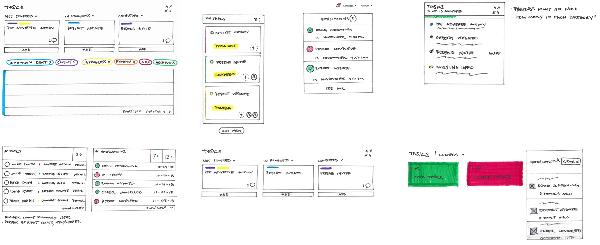
Ideate
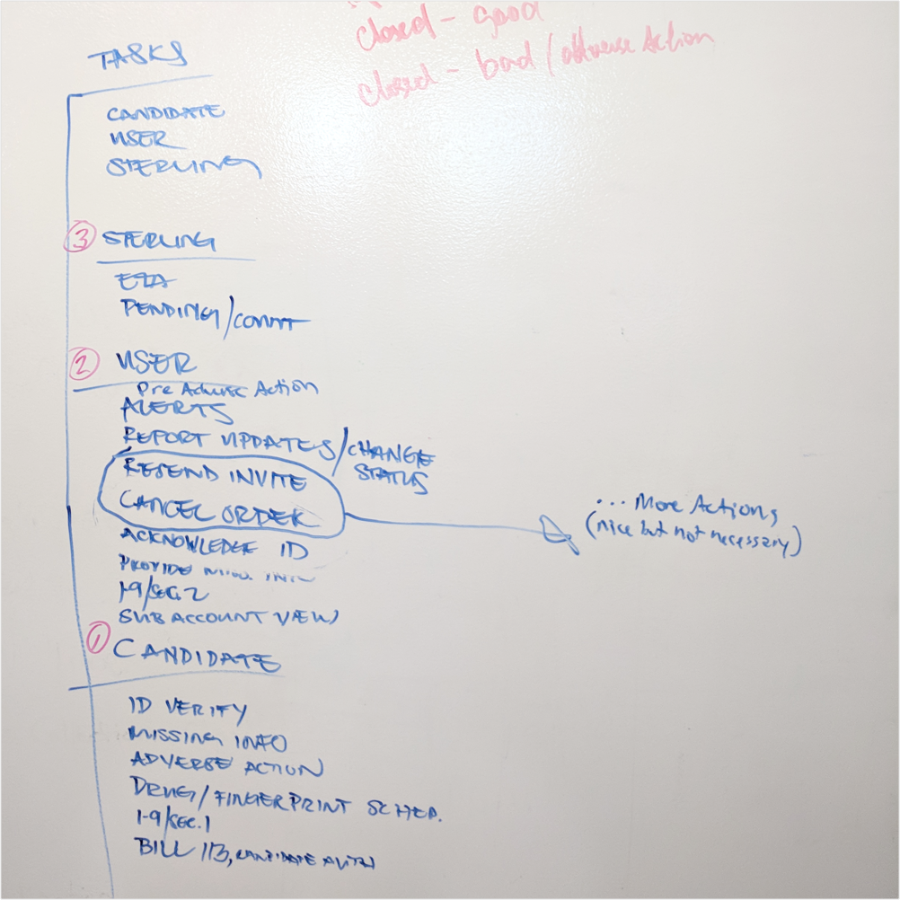
After defining requirements, we set out to explore solutions. This was a long process were I lead the team in our approach in conjunction with our daily workload.
Over the course of several months, we explored task management UI, Notifications, table displays, filtering controls, progress indicators and many other aspects of a dashboard experience.
Validate
WIREFRAMES
With such a large amount of objectives and infinite possibilities, I proposed dividing the intitial layout exploration between designers. We were able to each create a solid prototype that could be tested against each other in a much shorter time.
OBJECTIVES
- Learn ease of use and discoverability on several design ideas of the new Client Hub Dashboard
- Gain insights from target users about their experience with using background screening applications
- Gather feedback and qualitative data to support improve the Client Hub Dashboard design
TASKS LIST
- Provide first impressions
- What stood out first?
- Define the various order status
- Initiate an order
- Find orders that require user’s attention
- Filter all orders that are in progress
- View order summary of a candidate
- View completed report of a candidate
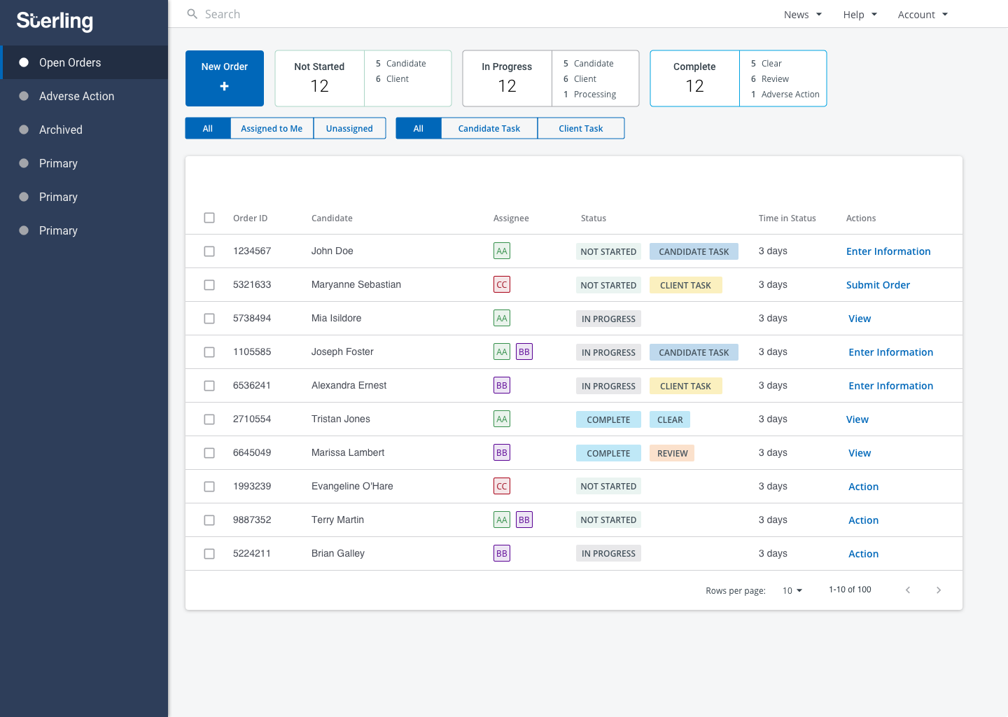
DESIGN A - FIRST IMPRESSION
- Clean, organized, well laid out
- Crowded, colorful, organized
- Clear, utilitarian, efficient
- Simple, straightforward, modern
- Well organized, easy, uncluttered
WHAT STOOD OUT FIRST?
- Color coding
- Progress bar and tiles on top of the page
- Lots of colors can be tricky, but participant understood that it is needed for categorization
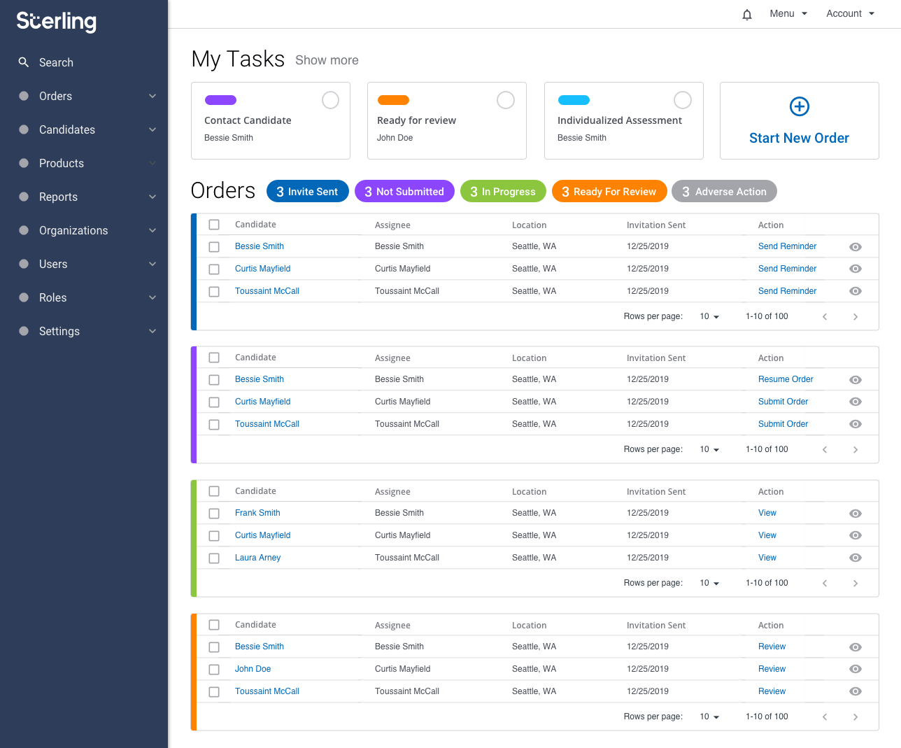
DESIGN B - FIRST IMPRESSION
- Organized, Text Heavy, Overwhelming
- Busy, clean, informative
- Data, organized, intuitive
- Overwhelming, colorful, not simple
- Organized, design, color
WHAT STOOD OUT FIRST?
- Color coding of the status
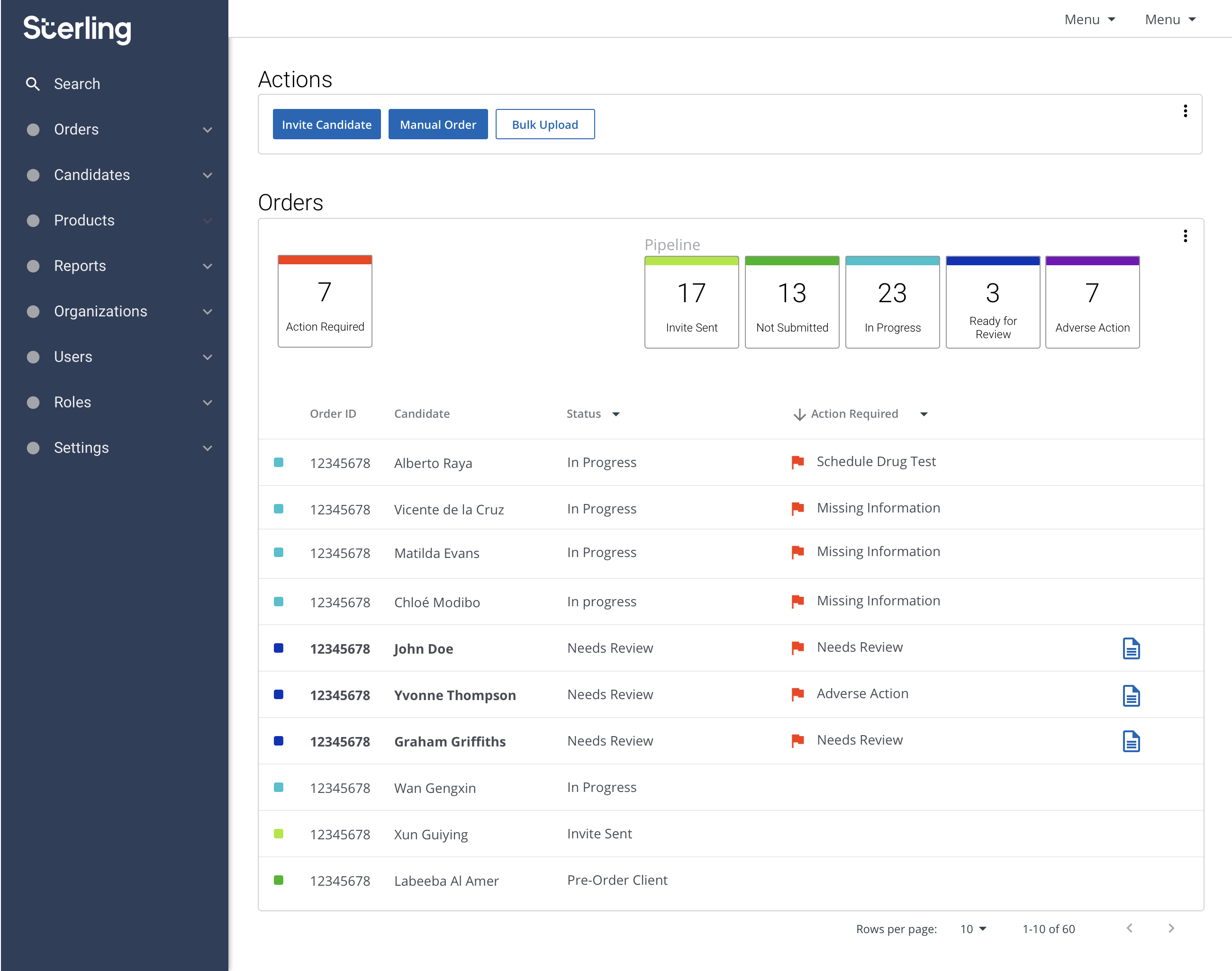
DESIGN C - FIRST IMPRESSION
- Simple, straightforward, clean
- Action-oriented, reports, templates
- Professionally designed, easy to understand, very appealing
- Clear, Logical, Simple
- Functional, colorful, organized
WHAT STOOD OUT FIRST?
- Action Required and Status
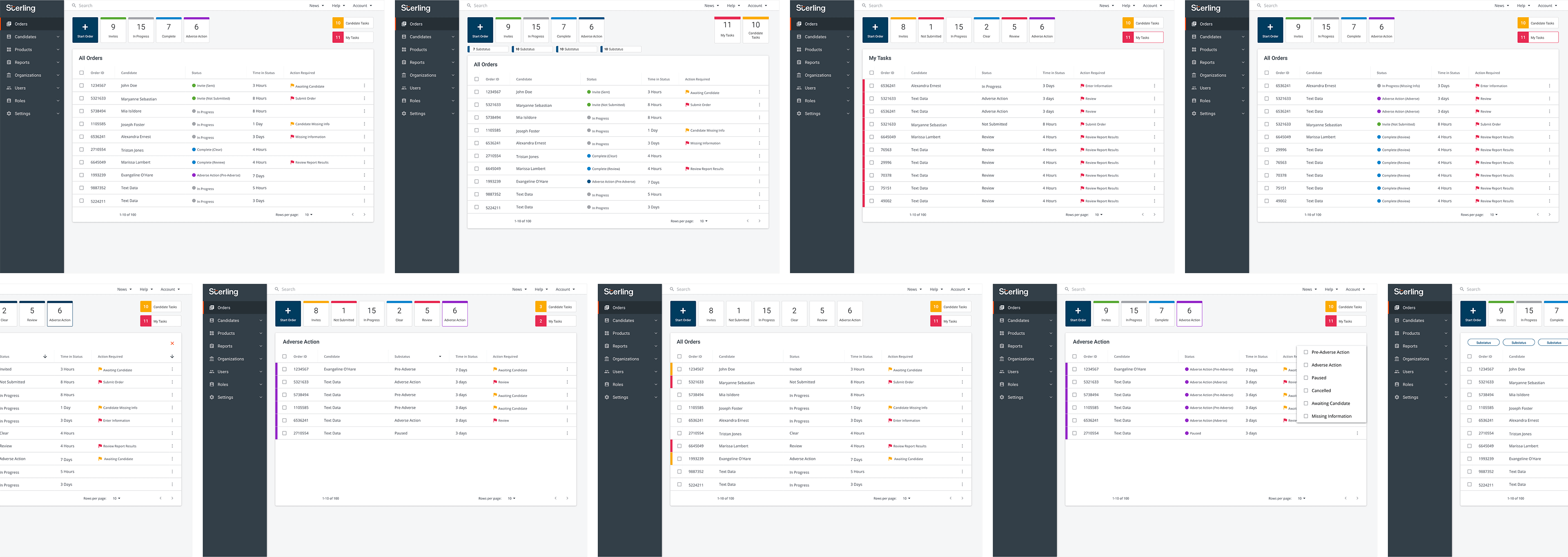
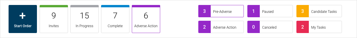
Definition of order status
INVITE SENT
- Invitation sent to a candidate to complete background check
- Invitation sent to candidates but haven’t been responded
READY FOR REVIEW
- Results are in and waiting to be reviewed
NOT SUBMITTED
- Orders that user entered but have not completed the process yet or has not submitted the order
- Subset of Invite Sent total count that have not been completed
- Candidates have filled out the information, but user still needs to submit the order
- Candidate has started but has not submitted it yet
- 1 participant was not sure about this status.
IN PROGRESS
- Background is being done and waiting for results
- 1 participant mentioned, “this status is self-explanatory
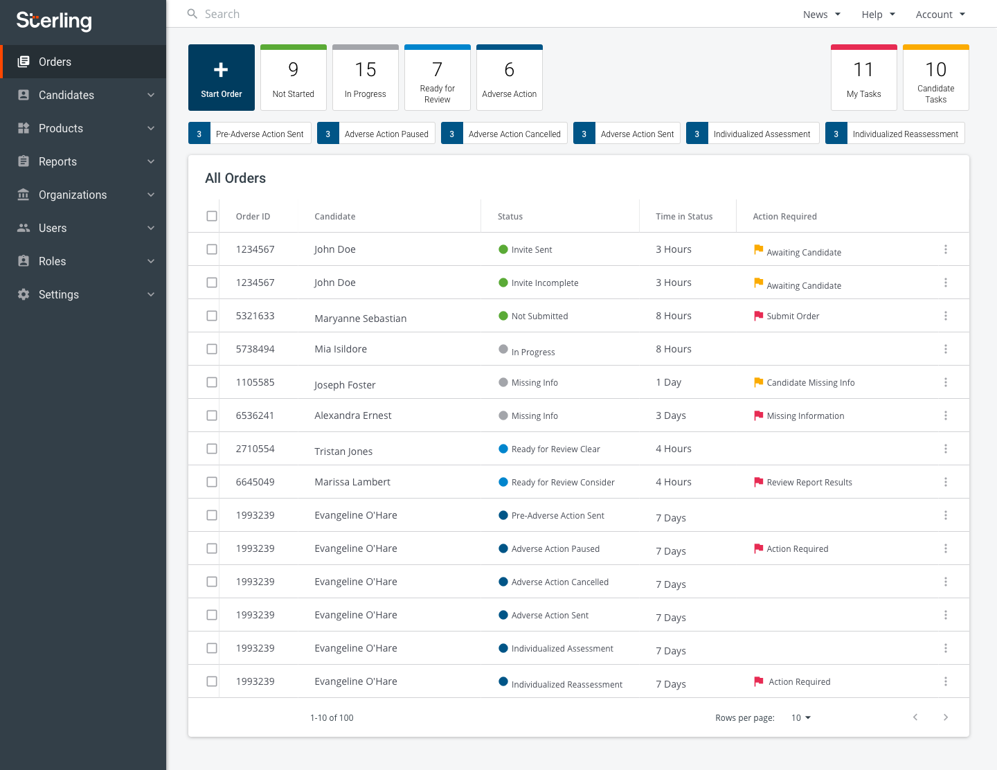
ADVERSE ACTION
- Most participants described it as it relates to Adverse Action process
- Thinks it is related or same as Action Required
SUMMARY
- Color coding of orders and well-organized order status emerge as primary key features that attract user’s attention
- Invite Sent, In Progress, Ready for Review, Complete are good choice for labels; Not Submitted and Not Started have mixed interpretations
- Initiate an order – Design A exhibited the most issues
- Find orders that require user’s attention – Requires more design refinement
- Filter all order by status – Design B & C had no issues with status filters
- View order summary – all designs were intuitive to let users find the order
ROUND 2 OBJECTIVES
- Establish the ideal color pattern used for Order Status in order to help users easily identify them
- Determine the functionality of the Order Status, Sub-Status and My Tasks filters
- Gather feedback and qualitative data to support improve the Client Hub Dashboard design
TASKS LIST
- Identify order status
- Compare two versions of the Order Status (Multi-Color vs Single Color)
- Use the Status and Sub-Status Filters
- Use the My Task Filter
- Compare three versions of the Filters (“Mutually-exclusive”, “Additive”, Filter Icon)
DIFFICULTY OF IDENTIFYING ORDER STATUS
Rating: 1 - Very Difficult | 5 - Very Easy
- Multi-colored tiles
- 4.6 - Group A
- 5 - Group B
- 4.8 - average for both groups
- Single color tiles
- 3.4 - Group A
- 5 - Group B
- 4.2 Average of both groups
HELPFULNESS OF COLOR PATTERN
Rating: 1 - Very Unhelpful | 5 - Very Helpful
- Multi-colored tiles
- 4.6 - Group A
- 5 - Group B
- 4.8 - average for both groups
- 4.6 - Group A
- Single color tiles
- 3.4 - Group A
- 5 - Group B
- 4.2 Average of both groups
- 3.4 - Group A
EFFECTIVENESS OF STATUS FILTER
9 participants expected orders to be filtered based on selected status. They preferred the "Mutually-exclusive" approach.
EFFECTIVENESS OF MY TASK FILTER
- Mutually-exclusive
- 9 participants expected to see all tasks regardless of selected status
- 1 participant expected to see all task within selected status and sub-status
- 9 participants expected to see all tasks regardless of selected status
- Additive
- 1 participant expected to see all tasks within selected status
- 2 participants expected to see all tasks within selected status and sub-status
- 7 participants expected to see all tasks regardless of selected status
- 1 participant expected to see all tasks within selected status
DESIGN PREFERENCE FOR FILTERS
- 4 participants preferred the sub-filters located inside the table
- 6 participants preferred the sub-filters located on top of the page
- 0 participants preferred the filter icon
SUMMARY
- Multi-Colored Tiles design was found to be most helpful with identifying status orders
- Some participants liked that the Single-Color design has more status available
- “Review” status is still confusing
- Both “Mutually-exclusive” and “Additive” designs were intuitive when used for filtering by status and sub-status
- Most participants expected “My Task” filter to display all tasks regardless if status and sub-status have been previously selected
- Majority of the participants prefer the design with the sub-status on top
- Filter icon is not very discoverable though easy to use once found
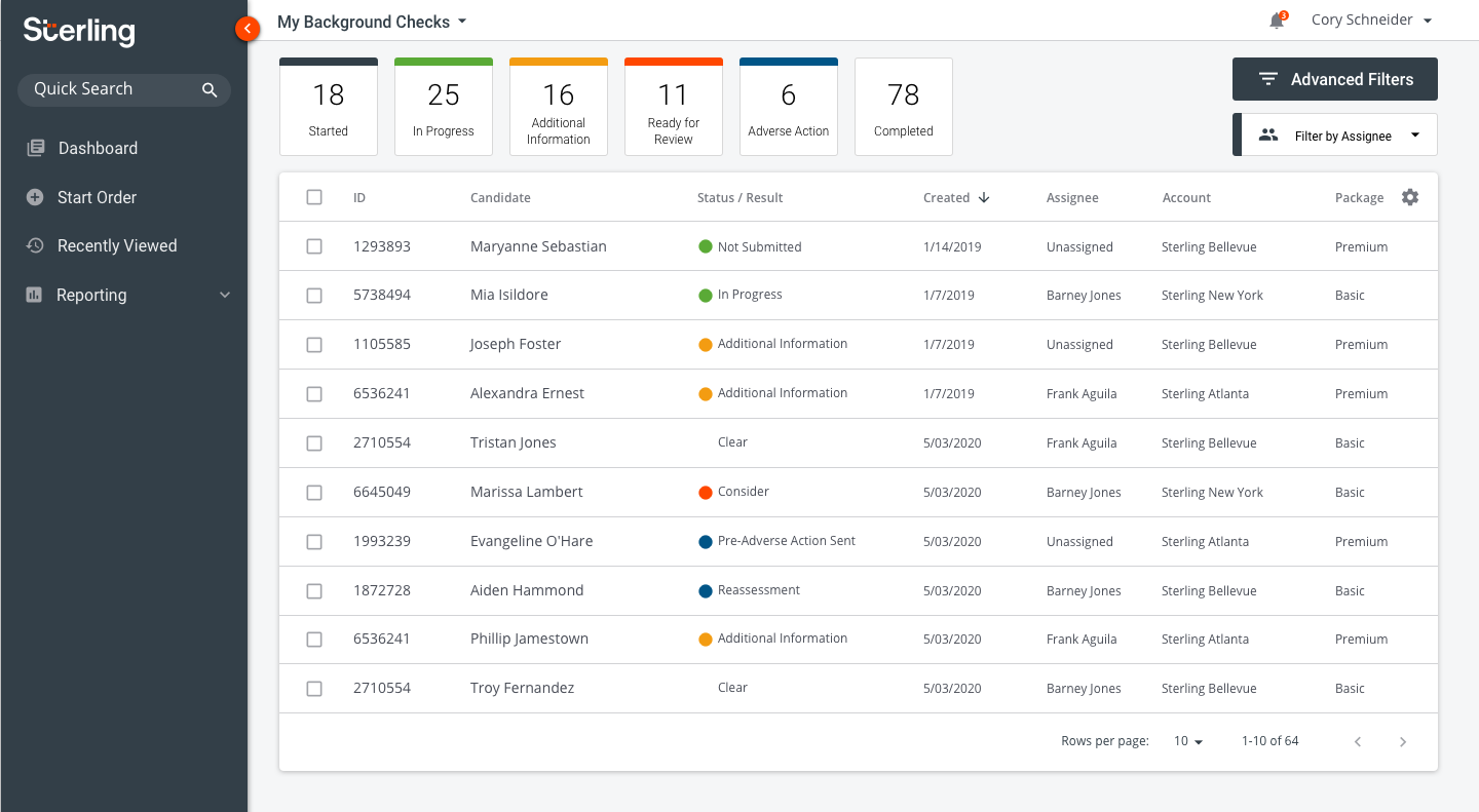
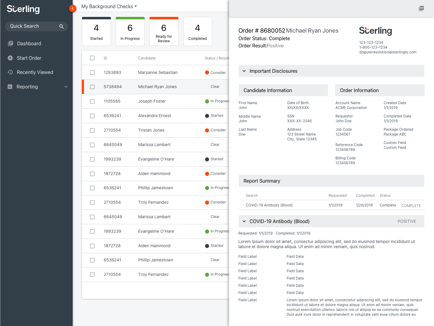
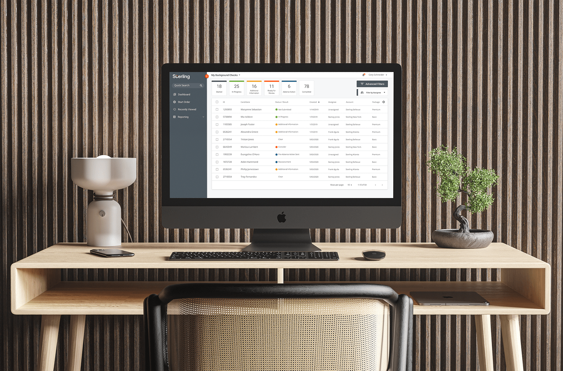
FINAL DESIGN
Additional small rounds of validation and testing were ran with clients and on usertesting.com. After much iteration and planning, we arrived at a final design for the dashboard.
Additional features such as "Advanced Filters," and "Filter by Assignee" were added to the experience to meet customer needs.